


Introduction
This feature is yet another charting innovation brought to you only by .netCHARTING. Axis time label automation is a collection of smart features that accurately describe the time segment shown on a time axis scale. With these user friendly and automatic features, your time based charts will be more intuitive and readable.
How smart is it?
Simply put, quite. This feature is aware of things such as whether your time span crosses into another day, month, or year and will point these things out to the viewer. It is also aware of how specific your data is; meaning, whether it's describing minutes, days, months and so on. This is a complicated task with countless permutations where you may require a behavior other than the default. Fortunately, this feature is also very well equipped with plenty of options that allow meticulous customization.
If this sounds useful for your projects, let's explore the topic a bit further.
Hierarchy & API
There are two separate mechanisms involved with time label automation. One generates single value labels and the other generates range ticks. The behavior or modes of these features are controlled with two properties:
- Axis.TimeScaleLabels.Mode (Single Value Mechanism)
Enumeration Members: TimeScaleLabelMode - Axis.TimeScaleLabels.RangeMode ( Range Value Mechanism)
Enumeration Members: TimeScaleLabelRangeMode
Additional options of these features are available through the Axis.TimeScaleLabels property.
Single Value Time Labels
Dynamic Mode
An automatically determined or specified time interval can be used with this mode. This mode will determine what the axis ticks are describing and apply the format strings and axis tick properties that correspond to the time instance of each axis tick. The format strings and axis ticks are found in the TimeScaleLabelInfo class and are covered in depth below.
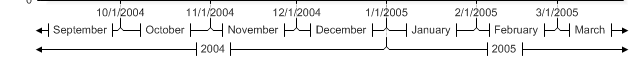
Let's start with an example. This is a normal time axis without any time automation. Only the time interval is automatically determined:

Now let's see how the automation engine will handle this scale in 'dynamic' mode.
[C#]

Chart.XAxis.TimeScaleLabels.Mode = TimeScaleLabelMode.Dynamic;
[Visual Basic]

Chart.XAxis.TimeScaleLabels.Mode = TimeScaleLabelMode.Dynamic

As you can see, the ticks are evaluated and for the most part have been determined to represent months, therefore, they are labeled with the month's name. One of the ticks, however, represents the year and is formatted to show the four digit year.
Smart Mode
The above, 'dynamic mode' uses static formats specified in the TimeScaleLabelInfo class. The smart mode will do the same, however, only if they are specified by the user. Otherwise the formats will be determined automatically based on a number of factors, resulting in a detailed and well laid out axis. Considering all the different factors, the smart time automation engine will choose from over 100 formats and templates to produce the most appropriate result.
[C#]

Chart.XAxis.TimeScaleLabels.Mode = TimeScaleLabelMode.Smart;
[Visual Basic]

Chart.XAxis.TimeScaleLabels.Mode = TimeScaleLabelMode.Smart
Hidden Mode
This mode will prevent any single value axis ticks from being shown on the axis. It is useful in conjunction with range time labels when the range time labels sufficiently describe the time segment and single value ticks are not desired.
[C#]
Chart.XAxis.TimeScaleLabels.Mode = TimeScaleLabelMode.Hidden;
[Visual Basic]
Chart.XAxis.TimeScaleLabels.Mode = TimeScaleLabelMode.Hidden
Ranged Time Labels
Default Mode
The default mode does not generate any axis ticks, unless, the time intervals to base those axis ticks on are specified. Adding range time intervals is explained below.
Dynamic Mode
When the TimeScaleLabelRangeMode.Dynamic mode is specified, the time span is analyzed to determine what time intervals should be used to generate ranged axis ticks. The range ticks are then generated based on those intervals. If range time intervals are specified by the user this mode will not generate axis ticks based on any additional automatic time intervals. In effect, it will behave like the Default mode.
Consider the following axis scale:
 |
The chart will be widened below so everything is shown properly. |
[C#]

Chart.XAxis.TimeScaleLabels.RangeMode = TimeScaleLabelRangeMode.Dynamic;
[Visual Basic]

Chart.XAxis.TimeScaleLabels.RangeMode = TimeScaleLabelRangeMode.Dynamic
The resulting axis:
Because the axis ticks represent months and span into a different year, range axis ticks were created for both of these units of time.
 |
In some instances, there will be a large number of range ticks generated in which case, they will span multiple rows. Since this may not be desirable, using Axis.TimeScaleLabels.MaximumRangeRows will provide a way to limit the number of rows drawn. |
Specifying Range Time Intervals
Time intervals can be added using the Axis.TimeScaleLabels.RangeIntervals property. When specified, they are always generated and the dynamically determined time intervals are omitted. This code snippet will also demonstrate using TimeScaleLabelMode.Hidden to hide the single value ticks.
[C#]
Chart.XAxis.TimeScaleLabels.Mode = TimeScaleLabelMode.Hidden;
Chart.XAxis.TimeScaleLabels.RangeIntervals.Add(TimeInterval.Month);
[Visual Basic]
Chart.XAxis.TimeScaleLabels.Mode = TimeScaleLabelMode.Hidden
Chart.XAxis.TimeScaleLabels.RangeIntervals.Add(TimeInterval.Month)

|
TIP: Multiple range intervals can be added simultaneously using a single line of code: Chart.XAxis.TimeScaleLabels.RangeIntervals.Add(TimeInterval.Months, TimeInterval.Years) |
Custom Styling and Formatting
The time label automation mechanism will describe the time segment accurately, but, it may not describe it exactly as you'd like. This section describes the options available for this customization.
The axis property TimeScaleLabels is an Axis.TimeScaleLabelInfo class. This class contains format strings and axis tick objects that correspond to time units used by these features. Because time automation is based mainly on time instances, the generated labels can be fully controlled through objects you may already be familiar with.
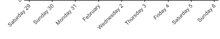
For example, let's consider this is our time scale using dynamic mode:
Format Strings
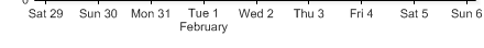
The labels are long and this is causing them to angle. The day labels don't NEED to spell the whole word out, therefore, the days format string will be modified to only abbreviate the day names using the following code:
[C#]

Chart.XAxis.TimeScaleLabels.DayFormatString = "ddd d";
[Visual Basic]

Chart.XAxis.TimeScaleLabels.DayFormatString = "ddd d"

Label Templates
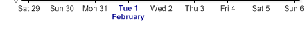
Now that the labels aren't angled, the there is another thing that stands out a bit, or rather, doesn't stand out enough. The February tick can be easily missed and it doesn't tell us what day it is describing. If we change its format to show all this information, this label will be long and cause the labels to angle again. To overt this problem, we will instead manipulate the month's axis tick label to show all the information we need and add a new line character to draw the label on two lines and keep it narrow.
[C#]
Chart.XAxis.TimeScaleLabels.MonthTick.Label.Text = "<%Value,ddd d>\n<%Value,MMMM>";
[Visual Basic]
Chart.XAxis.TimeScaleLabels.MonthTick.Label.Text = "<%Value,ddd d>\n<%Value,MMMM>"
|
Tip: It may also be useful to use a smaller font to create more room for axis ticks. |
Styling
Now the scale looks much better. Still, for those of you who always give 110%, let's go a step further and make those month labels really stand out. As we've seen in the above example, an AxisTick is exposed for each time unit. This gives us complete control over its appearance. This code will modify the month label's font and color.
[C#]

Chart.XAxis.TimeScaleLabels.MonthTick.Label.Font = new Font("Arial",8,FontStyle.Bold);
Chart.XAxis.TimeScaleLabels.MonthTick.Label.Color = Color.DarkBlue;
[Visual Basic]

Chart.XAxis.TimeScaleLabels.MonthTick.Label.Font = New Font("Arial",8,FontStyle.Bold)
Chart.XAxis.TimeScaleLabels.MonthTick.Label.Color = Color.DarkBlue
Range ticks can be customized in the same manner as the single value ticks. This code modifies the YearTick's font and line color.
[C#]

Chart.XAxis.TimeScaleLabels.YearTick.Label.Font = new Font("Arial",8,FontStyle.Bold);
Chart.XAxis.TimeScaleLabels.YearTick.Line.Color = Color.Blue;
[Visual Basic]

Chart.XAxis.TimeScaleLabels.YearTick.Label.Font = new Font("Arial",8,FontStyle.Bold)
Chart.XAxis.TimeScaleLabels.YearTick.Line.Color = Color.Blue

Test your skills
Now that you're a time label automation expert, let's test your skills and see if you can figure out the code used to generate this chart axis:
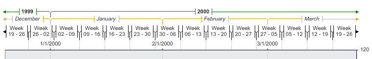
 Answer (code)
[C#]

 Chart.XAxis.FormatString = "d";

 Chart.XAxis.TimeLabelAutomation.RangeIntervals.Add(TimeInterval.Weeks, TimeInterval.Months, TimeInterval.Years);


 Chart.XAxis.TimeLabelAutomation.WeekTick.Label.Text = "Week\n<%Low,dd> - <%High,dd>";

 Chart.XAxis.TimeLabelAutomation.MonthTick.Line.Color = Color.Orange;
 Chart.XAxis.TimeLabelAutomation.YearTick.Line.Color = Color.Green;
 Chart.XAxis.TimeLabelAutomation.YearTick.Label.Font = new Font("Arial",8,FontStyle.Bold);
 Chart.XAxis.TimeLabelAutomation.MonthTick.Label.Font = new Font("Arial",8,FontStyle.Italic);
[Visual Basic]

 Chart.XAxis.FormatString = "d"

 Chart.XAxis.TimeLabelAutomation.RangeIntervals.Add(TimeInterval.Weeks, TimeInterval.Months, TimeInterval.Years)
 Chart.XAxis.TimeLabelAutomation.WeekTick.Label.Text = "Week\n<%Low,dd> - <%High,dd>"

 Chart.XAxis.TimeLabelAutomation.MonthTick.Line.Color = Color.Orange
 Chart.XAxis.TimeLabelAutomation.YearTick.Line.Color = Color.Green
 Chart.XAxis.TimeLabelAutomation.YearTick.Label.Font = new Font("Arial",8,FontStyle.Bold)
 Chart.XAxis.TimeLabelAutomation.MonthTick.Label.Font = new Font("Arial",8,FontStyle.Italic)