Default Box
A Box object is the foundation (base class) of box like objects such as annotations, legendBoxes, and title boxes. The chart control has a DefaultBox property that is a container for box properties that will be propagated to all other objects on the chart that derive from Box including annotations, legends, and title boxes. The default box corner related settings will also propagate to the chart areas.
Example: This code will make all box shadows red.
[C#]

Chart.DefaultBox.Shadow.Color = Red;
[Visual Basic]

Chart.DefaultBox.Shadow.Color = Red
Styling
Box styling consists of a background, the outline (Line), corner types, headers, and shadows.
Background
A box'es background is accessed through its Background property, which contains properties that effect the background's visual appearance:
Box.Background.__ = __
Example: The following code sample changes the box'es background color to red.
[C#]
Box.Background.Color = Color.Red;
[Visual Basic]
Box.Background.Color = Color.Red
See the Background class for more information.
Shadow
The shadow a box casts can also be modified. Options include color, depth, and whether the shadow is solid or soft, meaning, the edges are blurred for added realism.
[C#]

Box.Shadow.Color = Color.Orange;
[Visual Basic]

Box.Shadow.Color = Color.Orange
Outline
A Line object is used to draw the outline of a box. This enables you to specify many visual properties such as line width, color, and dash style.
Example: Changes the outline dash style.
[C#]

Box.Outline.DashStyle = DashStyle.Dash;
[Visual Basic]

Box.Outline.DashStyle = DashStyle.Dash
See also: Line Class, Chart Lines
Corners
Each of the four corners of a box can be individually styled. This code demonstrates how to specify a rounded top left corner.
[C#]

Box.CornerTopLeft = BoxCorner.Round;
[Visual Basic]

Box.CornerTopLeft = BoxCorner.Round
All four corners can be automatically set using the DefaultCorner property. This will also change the property value of each individual corner.
[C#]

Box.DefaultCorner = BoxCorner.Cut;
[Visual Basic]

Box.DefaultCorner = BoxCorner.Cut
Corner Size
The corner size can also be specified through the Box.CornerSize property. It is given in pixels.
Padding
The padding property specifies the distance form the box edges to it's content similar to HTML cell padding. The legendBox, which inherits from Box also uses the padding property to determine spacing between legend entries.
[C#]

Box.Padding = 5;
[Visual Basic]

Box.Padding = 5
Box Headers
Box headers is a new feature in version 4.4. It allows a header label and background style on top of any box such as TileBox, LegendBox, or Annotation. The header is activated simply by specifying a Box.HeaderLabel.Text string. If there is no text available, the header is not visible. The following example adds a header to the legend box with a different background.
Box Header Styling
Version 6.1 introduces a much more advanced header feature set. It provides an API that enables styling headers to emulate many different visualizations. Box.Header is now its own object containing all the header related properties.
Header Cap Styles
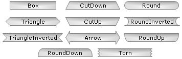
The header left and right sides can be styled to change their shape. The header object contains two properties; StartCap, and EndCap which refers to the left and right sides, respectively. Both properties can use any style specified and will render the header accordingly. There are currently 13 box cap styles available allowing 169 different combinations. The styles are described by the BoxCapStyle enumeration, and the code below shows how they can be set.
|
|
|
|
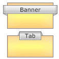
Ribbon Caps Ribbon caps can be set with BoxCapStyle.RibbonUp/RibbonDown options. Ribbon caps behavior is slightly more complex as the ends must extend to the back of the parent box. Ribbons may alter their angles in order to reach the back of the parent box. The ribbons can render differently depending on the header positions. Figure 1b shows headers with the same RibbonDown settings. The banner extens outside the left and right sides while the tab does not and the resulting rendering is different. If the ribbon setting is not applicable, it will be omitted. For example when the header is above the box and RibbonUp is set, the ribbon cannot reach the parent box moving up so no cap will be rendered. |
|
Vertical Alignment
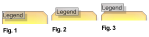
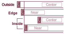
Header boxes can be positioned vertically in relation to the parent box edge. The EdgeAlignment enumeration specifies this positioning with Inside/Outside/Edge. Figure 1-3 demonstrates the positions when used with the Box.Header.VerticalAlignment property.
|
Header.VerticalAlignmet = EdgeAlignment. |
Horizontal Alignment
The header object has two properties; StartAlignment, and EndAlignment. They dictate how the left and right sides of the header are aligned to the parent box and header label, but they do not affect the label alignment to the parent box.
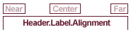
Box.Header.Label.Alignment
The label alignment will dictate the label's position across the entire parent box regardless of any header start and end alignments settings. The label positions are shown below in Figure 4.
|
|
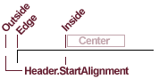
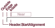
Box.Header.StartAlignment/EndAlignment
The Header.StartAlignment and Header.EndAlignment properties use the same EdgeAlignmentenumeration as Header.VerticalAlignment property, and they behave similarily. Outside and Edge options will align based on the parent box edge. Inside alignment will align at the label alignment or box edge. The Inside setting also considers if the box sides have a cap. When a header label is aligned to the box edge with a cap, it might offset the label position so both cap and label can be within the parent box bounds. The figures below show what these settings do when used with Header.StartAlignment. The behavior is the same with Header.EndAlignment.
|
EdgeAlignment.Outside - The header box will extend past the parent box edge by the pixel amount specified with Box.CornerSize. EdgeAlignment.Edge - The header box will line up with the parent box edge. If specified, a the base of a cap is aligned with the parent box and is rendered just outside the box as shown in figure 7. Edge Notes
EdgeAlignment.Inside - When the label is not aligned to this edge, the header side will align with the label. When the label is aligned with this side, and the side has a cap style, the label is pushed in so the header and cap can be rendered inside the box. (See figure 7)
Header Cap Placement When using BoxCapStyle.Box, no cap is used. With other styles, a cap is drawn outside of the original box. So Box capped headers will be a bit smaller than others. The width of the caps is half the height of the header label. (See Figure 1a)
|
|
|
Header Orientation The property Box.Header.Orientation controls the orientation of the header in relation its parent box. Figure 9 shows how the header is oriented depending on the different orientation settings. All the other alignment settings will behave the same regardless of the orientation. The bottom orientation however orients vertically so it can be read so some settings may change to achieve the same visual. For example cap styles such as RibbonDown will have to change to RibbonUp with Orientation.Bottom. Corner orientations such as TopRight are not supported at this time. |
|

|
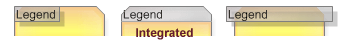
Integrated Header When both sides of the header are aligned to Edge, and both sides use the Box cap style, the header will integrate with the parent box as the middle box in figure 8 does. These are the default settings. When integrated, the header.Line is not used to draw an outline. Instead, the parent box outlines the header and content together. Box.InteriorLine is used to draw a divider line between the header and content. |
|
Other settings
Header.Line
This line object is used to draw an outline of the header box shape.
Header.Offset
This property takes a Point object and uses it to offset the header position from the original placement. It is a simple yet powerful feature that can be used to make small visual adjustments to achieve the exact look that is needed.
Header.Shadow
The header shadow defines properties of the shadow cast beneath it.
(See floating visual below).
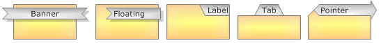
Visualizations
The header can emulate a number of different visuals such as banners, tabs, pointers and so on. This image shows some examples of these:
Uses
- Element Annotations (enhance callout)
- Arbitrary Annotation / Legend Header Styling