Introduction
|
TreeMap charts are used to display hierarchial tree structure data with nested rectangles. TreeMap charts can be created manually or by using live data. Features
To use the treemap chart type, the following code can be used. |
|
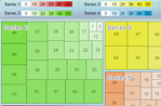
Series Spacing
With a single series on the chart, the spacing is ignored. With multiple series however, the ChartArea.Padding property specifies the space between the series boxes and chart area edges in pixels. The following code will create a 5 pixel gap between the series and chart area.
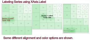
Series Labeling
The series rectangle can be labeled in two ways on a TreeMap chart. A label can be drawn inside the series rectangle or the series rectangle can utilize a box header label.
|
Series.Box.Label |
|
|
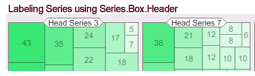
Series.Box.Header.Label The box header can place the series label outside the series bounds and can take up more space, however, it helps prevent the label from overlapping the elements and possibly hiding some data. Using Header.VerticalAlignment = EdgeAlignment.Edge is useful in this situation, as it does not intrude too much onto the series rectangle and minimizes the series label use of space. See the Box Tutorial for more information about manipulating the box header. It offers a robust array of options that affect the way the header is drawn. Series tokens can be used with both labeling methods and will be evaluated with the series information. See Tokens Reference for a full list of available tokens.
It is also possible to use both types of labels simultaneously. For example, one label can be used to describe the series name and the other to display values or totals.
|
|
Element Labeling
|
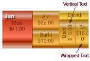
Element labels behave much like any other element labels using all the same applicable properties. If there is not enough space to fit the label properly, the chart will attempt to draw the label vertically, or wrap the text so it can be seen. The following SmartLabel properties can be used.
Because SmartLabel overwrites the base label's Alignment property of type StringAlignment with an Alignment property of type LabelAlignment, you must cast the smart label to a label object and then set the base alignment property like so: ((Label)Chart.DefaultElement.SmartLabel).Alignment = StringAlignment.Near;
|
 |
|
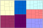
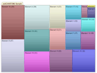
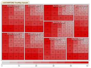
Coloring Elements By default, all elements of a series will have the same color. This coloring is the default behavior for all chart types, and TreeMap uses the same generic algorithms. (See Figure 1) For this chart type it can be useful to color each element with a different color. This is done by setting either Series.Palette or Series.PaletteName properties. (See Figure 2). A much more useful coloring method is to use color ranges to automatically color elements based on their values. This allows an easy way to quickly understand the values of elements based on their colors. (See Figure 3). When using color ranges, a legend color swatch may be used to allow the user to match element colors with their approximate values. The Color Ranges tutorial describes how to use color ranges to apply to elements and how to create the legend color swatches.
|
||
|
|
|
|