


Default Box
A Box object is the foundation (base class) of box like objects such as annotations, legendBoxes, and title boxes. The chart control has a DefaultBox property that is a container for box properties that will be propagated to all other objects on the chart that derive from Box including annotations, legends, and title boxes. The default box corner related settings will also propagate to the chart areas.
Example: This code will make all box shadows red.
[C#]

Chart.DefaultBox.Shadow.Color = Red;
[Visual Basic]

Chart.DefaultBox.Shadow.Color = Red
Styling
Box styling consists of a background, the outline (Line), corner types, headers, and shadows.
Background
A box'es background is accessed through its Background property, which contains properties that effect the background's visual appearance:
Box.Background.__ = __
Example: The following code sample changes the box'es background color to red.
[C#]
Box.Background.Color = Color.Red;
[Visual Basic]
Box.Background.Color = Color.Red
See the Background class for more information.
 |
See sample: BoxStyling.aspx |
Shadow
The shadow a box casts can also be modified. Options include color, depth, and whether the shadow is solid or soft, meaning, the edges are blurred for added realism.
[C#]

Box.Shadow.Color = Color.Orange;
[Visual Basic]

Box.Shadow.Color = Color.Orange
Outline
A Line object is used to draw the outline of a box. This enables you to specify many visual properties such as line width, color, and dash style.
Example: Changes the outline dash style.
[C#]

Box.Outline.DashStyle = DashStyle.Dash;
[Visual Basic]

Box.Outline.DashStyle = DashStyle.Dash
See also: Line Class, Chart Lines
Corners
Each of the four corners of a box can be individually styled. This code demonstrates how to specify a rounded top left corner.
[C#]

Box.CornerTopLeft = BoxCorner.Round;
[Visual Basic]

Box.CornerTopLeft = BoxCorner.Round
All four corners can be automatically set using the DefaultCorner property. This will also change the property value of each individual corner.
[C#]

Box.DefaultCorner = BoxCorner.Cut;
[Visual Basic]

Box.DefaultCorner = BoxCorner.Cut
Corner Size
The corner size can also be specified through the Box.CornerSize property. It is given in pixels.
 |
A legendbox corner size it is limited to 0-8 unless the legendbox padding is set to a higher value that will prevent text clipping. Other boxes that use a setting higher than 8 will automatically add padding to fit text inside it. |
|
Tip: Today's styling trends dictate that using a unique corner on opposite ends of a box while keeping the adjacent corners intact is visually pleasing. For Example TopLeft:Cut and BottomRight: Cut while TopRight and BottomLeft setting is: Square. |
Padding
The padding property specifies the distance form the box edges to it's content similar to HTML cell padding. The legendBox, which inherits from Box also uses the padding property to determine spacing between legend entries.
[C#]

Box.Padding = 5;
[Visual Basic]

Box.Padding = 5
 |
Note: Custom corners do not effect a box'es padding, hence, additional padding may be required when content is to close to a styled corner like BoxCorner.Cut. |
Box Headers
Box headers is a new feature in version 4.4. It allows a header label and background style on top of any box such as TileBox, LegendBox, or Annotation. The header is activated simply by specifying a Box.HeaderLabel.Text string. If there is no text available, the header is not visible. The following example adds a header to the legend box with a different background.
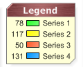
[C#]Chart.LegendBox.HeaderLabel.Text = "Legend Box";
Chart.LegendBox.HeaderBackground.Color = Color.Green;
[Visual Basic]Chart.LegendBox.HeaderLabel.Text = "Legend Box"
Chart.LegendBox.HeaderBackground.Color = Color.Green
|
See Sample: Features: BoxHeaders.aspx |