


Introduction
InfoGrids™ produce results similar to data grid controls; however, they are created and drawn within the chart image itself. As a result, an InfoGrid™ can be styled to produce a significantly more polished and integrated grid that users can take with them, along with that chart, in a single image file. This is made possible by using .netCHARTING's advanced label layout and styling markup features. The markup provides a quick and simple way of creating aesthetically pleasing grids from your data. By utilizing data aggregation and date grouping features of the DataEngine, .netCHARTING provides a complete solution for advanced dashboard development. MicroCharts can be added to InfoGrids™ to provide a clear visual representation of your data or alert users of situations requiring attention. Every label on a chart supports these advanced features, which enables seamlessly integrated charts with a level of detail that was previously not possible. In addition, every chart tooltip can interpret these tags as well. While InfoGrid™ labels are primarily used to describe chart elements and objects, a chart showing only an infoGrid™ is also possible. The property (Chart.ObjectChart) can be used with a Label or Annotation object to generate a chart image comprised of only the label, whether it's a complex matrix of information or a simple text string. This feature will also dynamically size the resulting image based on the output label or infoGrid size.
Markup Tags review
To create InfoGrids™ with .netCHARTING markup only two tags are necessary. A block tag and a row tag. A block tag which indicates a new block or that the text following it will be inside that block until a new block or a row tag is detected. A row tag just goes to the next line or row of blocks. The only requirement is that each row contains the same number of blocks. This signals the label parser to lay them out as a grid.
Q: What constitutes a block?
A: Any text is automatically inside of a block. MicroCharts and embedded images are blocks and blocks can be explicitly defined by using additional <block> tags.
InfoGrid™ Construction Techniques
Creating an InfoGrid™ consists of making a string of text that defines the information and markup tags. The process can be simple:
- Define a row of header blocks
- Iterate data adding additional rows of data making sure the block counts in each row are constant.
|
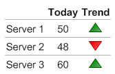
Take this InfoGrid for example: It is a 3x4 block grid. To define the header row, the following is used: string gridText = "<block><block fStyle='Bold'>Today<block fStyle='Bold'>Trend<HR>";
This defines 3 blocks and that the text should be bold. |
 |
!Widget rendering error!
Subsequent rows can be defined with:
gridText += "Server 1<block hAlign='Center'>50<Chart:Marker type='Triangle' Color='Green'>";
Alternating color fill
An infoGrid can highlight every other row for easier reading by using a background color in blocks of every other row using code like:
[C#]

for(int i = 0; i < rows; i++)
{
    string bg = "";
    if (((i & 1) != 0)) bg = " bgColor='LightGray'";
    sb += "<block " + bg + ">Block Text";
}
[Visual Basic]

For i As Integer = 0 To rows - 1
    Dim bg As String = ""
    If ((i And 1) <> 0) Then
       bg = " bgColor='LightGray'"
    End If
    sb &= "<block " & bg & ">Block Text"
Next i
 |
A demonstration of this usage can be seen in sample LegendInfoGrid2 |
Spacer Row
An extra row at the beginning of any grid can be utilized to define widths of each column. A spacer microChart type can be used to achieve this using code like:
string gridText = "<Chart:Spacer width='20'><Chart:Spacer width='30'><Chart:Spacer width='30'> '";
 |
NOTE: The default size of a spacer is 1x1 |
InfoGrids™, MicroCharts, and the DataEngine
The DataEngine provides a plethora of features that load database data and perform operations such as data aggregation and calculation based date grouping that would otherwise require a great deal of effort. InfoGrids can take advantage of this to display the processed info by building the grid from series and seriesCollections returned by the DataEngine. The series object also includes a method [Series.GetYValueList()] that returns a comma delimited list of y values it contains so that they can be easily used within microChart tags. It is similar to using the %YValueList series token with MicroCharts used in chart labels.
|
Sample: Dashboards And InfoGrids/InfoGridMulti utilizes the Series.GetYValueList method. |
ObjectChart & NoDataLabel
The Chart.ObjectChart property can take a Label or Annotation and when used, it becomes the chart almost like its own chart type. The difference in behavior between this chart type and others, is that with ObjectChart, the resulting image conforms to the size of the label. This sizing can be adjusted by using the Chart.Margin properties. To specify a static size for the resulting image, Chart.NoDataLabel can be used instead. Then the resulting image will be that defined by the chart size/width/height properties. If Chart.ObjectChart is used and the chart series collection is populated with data, SeriesCollection token will be processed for the text set for the label or annotation.
[C#]

Chart.ObjectChart = new Label("<Chart:Bar value='10' max='15'>");
[Visual Basic]

Chart.ObjectChart = new Label("<Chart:Bar value='10' max='15'>")
A more complicated arrangement using multiple infoGrids on one chart image can also be achieved by using multiple annotations. In these cases, the annotation positions and chart sizes must be specified explicitly which is not as dynamic of a scenario but it does add the advantage of box styling provided by the annotation.
|
Sample: InfoGridMulti.aspx demonstrates this multiple InfoGrid usage and styling options. |
InfoGrids™ in Charts
IntoGrids can be used with charts to give more detail by displaying the values of the charted elements. This can be achieved in a number of ways. One way is to increase one side of a chart's margin to make room for an annotation and then add the annotation specifying the position and size to fill the empty area. The other and simpler way is to use the legendBox to hold the grid. This is done by using the header label and hiding the series legend entries so only the header has content. This method has the advantage of automatically sizing and fitting both the chart and InfoGrid on the chart.
|
The LegendInfoGrid* samples demonstrate the latter usage. These samples utilize the main chart legend box, however, the original legend box does not have to be removed. A new legend box can be created for this purpose as well. |
Axis Tick InfoGrids™
| The sample GanttDependencies2 shown on the right uses infoGrid techniques to create a table like grid for each gantt task or element. This is possible through the use of the spacer described above. Each axis tick label is assigned with text containing two rows. One row is the spacer string like the above, and the next contains the text describing the element. An additional annotation using the same spacer string is created and absolutely positioned above the axis labels as a header. | 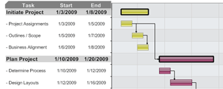 |