Introduction
Organizational charts can be created using .netCHARTING by getting data from live databases or by adding it manually in code. Organizational nodes can be decorated and styled in many ways by using the element annotation properties. Using the label markup language; custom layout, images and other content can be organized inside each node. Rich interactivity features are provided to enable organizational chart drilldown, node expansion, and AJAX scrolling for large datasets. Other useful navigation features include drilldown breadcrumbs and indicators to accent the node appearance.
About Organizational Charts
As with other charts, each node in an organizational chart is represented by an element object. The element's annotation is used to define node styling and content. Annotation label text can be specified to define the node content, but if not set, the element name will be shown inside the annotations.
An organizational chart has a single element at the top of the hierarchy. Every other element will have either ParentID or Parent properties set to identify its parent element. All elements can be in a single series, however, the Series.Line property is used to style the connections between elements so multiple series can be used to group elements that use the same connecting line style.
Elements with no names or annotation labels can be used as invisible placeholders to create more complex layouts. When used, a straight line is drawn through the location of the element as demonstrated in sample Chart Type Gallery/Organizational/M10.
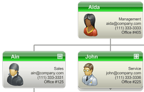
Data Acquisition
To retrieve an organizational chart from a database table, each row must have an ID and a ParentID. This shows an example of how an organizational chart gets its data. It also adds several attributes to each element from other table columns such as Name, Office, Email, etc..
Custom attributes can be shown in the annotation (node) labels using tokens such as %Office %Email and so on. If iterating the elements in code, attributes can be retrieved using code such as:
string value = element.CustomAttributes["office"];
For more information, see the Custom Attributes Tutorial.
Organizational SplitBy
Organizational nodes can be grouped into different series automatically based on the value of a specified database column. This code acquires the same data as the above, but it groups the nodes by 'Department'. Note that splitby is specified in the DataFields property.
Adding Data Manually
When adding organizational elements manually, either the element InstanceParentID or Parent properties must be set. The InstanceParentID property takes a numeric id matching the parent element's InstanceID property. Alternatively, the parent element object can be specified for each child element's Parent property.
This sample demonstrates adding nodes manually without IDs. It is useful because it makes adding data with code easier.
The following code snippet creates the same chart but using InstanceID and InstanceParentID properties to define the hirerarchy.
|
Styling Organizational Charts The chart area padding controls the spacing between nodes and chart edges. The Chart.DefaultSeries.Line property can be used to define the default connecting line styling between nodes. To specify a default annotation style, instantiate a new annotation object for the Chart.DefaultElement.Annotation property and modify those properties. They will automatically be used by all the annotations on the chart, unless otherwise specified. Using the .netCHARTING markup language provides a way to control the layout of the text and images inside the annotations. The markup language tutorial explains how to use this markup. The text and markup can be specified with the Annotation.Label.Text property. Annotations have two content areas. When a string is set with Annotation.HeaderLabel.Text, that content is placed in a header which allows separate background styling.
See also:
|
|
This sample code demonstrates styling the default annotation of a chart:
Iterating elements to specify styling individually is done in the same way except element.Annotation would be used for each object instead of Chart.DefaultElement.Annotation. However, the annotation must be instantiated for each element before accessing its properties.
Organizational Chart Navigation
Organizational chart nodes can be fairly large and with many of them on a chart, it is difficult to view them all at the same time. When a large number of nodes is loaded into a chart, the chart will try to render them on a larger image and scale it down to fit the chart area. This can result in nodes showing up very small.
A number of methods and features are provided to facilitate navigating large and complex organizational chars in a simple and intuitive way. This functionality is implemented with a lower level API that is more flexible and allows creating highly customized navigation experiences.
ASP.NET AJAX Scrolling
The most easy to use feature to facilitate navigating large organizational charts, is by using the AJAX Zoomer. Simply use Chart.Zoomer.Enabled = true to enable this feature. This feature behaves differently with organizational charts. There are no context menu options for zooming in or out. It allows the entire set to be loaded into a chart, and if it generates an image too large for the chart area, drag scrolling and scrollbars become available.
Organizational Node DrillDown
This concept provides the ability to click on a node, and navigate into an organizational hierarchy subset without displaying all the nodes at the same time. The Series.Trim method provides this ability, and works by returning a subset of nodes based on the root ID of an element, and the number of subsequent levels of child nodes to include in the result. Annotation hotspots are used with a URL to postback the ID of the clicked annotation. Then the page must get this ID and pass it to the trim method in order to display the correct subset of nodes.
Drilldown Breadcrumbs
Drilldown breadcrumbs provide a way to keep track of the location within an organizational hierarchy when using drilldown features. Breadcrumbs are common and look something like this:
Animals / Feline / Cheetah
Samples such as OrgDrilldown demonstreate how to use this feature in a drilldown context. The sample OrgBreadcrumbs uses this method to get an array of breadcrumb strings, and display them as annotations.
Consider the following code creating a breadcrumb path
string path = series.GetElementBreadcrumbs(elementID, elementCrumb, lastElementCrumb, separator);
The above usage specifies the elementID of the last element or 'Cheetah' in the above example. The elementCrumb is a label template that can use element tokens such as %Name. This would be applied to the underlined crumbs 'Animals' and 'Feline'. Common usage would require these nodes are linked. Using this string as the elementCrumb template will create links for those crumbs:
string elementCrumb = "<block url='?id=%id' fColor='blue' fStyle='underline'>%Name";
The lastElementCrumb can be just the name with no links or styling to indicate it is not clickable:
string lastElementCrumb = "<block>%Name";
The separator also uses the block tag to terminate any block tags previously added by the elementCrumb template.
string separator = " <block>/ ";
The resulting string can be added anywhere on the chart, like in the chart title box, chart area label, or in a floating annotation amongst others.
Organizational Node Attributes
The Series.Trim method also analyzes the dataset and optionally populates element attributes that indicate the level in the hierarchy and node type such as whether elements have parent or child nodes not shown in the resulting subset of nodes.
Sample OrgLevels uses the trim method to not trim the nodes but just to analize the dataset and populate organizational level attributes for each element. Then they are colored based on the hierarchical level.
This table describes the attributes added by the Trim method.
| Attribute Name | Values and Descriptions |
| NodeType |
EndNodeWithChildren - Indicates this element's children are trimmed from the result but child elements exist. |
| OrganizationalLevel | A number ranging from 1 to n levels in the data set indicating the level of each particular element. |
Organizational Indicators
The NodeType attributes can also be used to style the annotations by drawing an accent above or below the node. For example, if the element's NodeType attribute value is 'RootWithParents', an accent is drawn above the annotation, and if the value is 'EndNodeWithChildren', it is drawn it below it. This is demonstrated in sample OrgIndicators where these attributes are set manually to display the accent, and in sample OrgDBDrilldown where they are supplied by the trim method.
Organizational Node Expansion
This feature allows the user to click on any node to expand or collapse its children, thereby exploring the hirerarchy while displaying only the expanded nodes. This is similar to drilldown, however, it requires that a comma delimited list of expanded node IDs is maintained by the page code or application. Another overload of the Trim method can take this list of IDs and return only the nodes that should be visible.
Combining Navigational Features
When using organizational expansion, it is useful to enable the AJAX zoomer so that when the expanded nodes create a large image, scrolling is enabled to help navigate around (Sample: OrgExpansionDB).
Because organizational charts with many elements can result is huge images, making the nodes smaller with less information can help fit much more of a hierarchy onto a chart. The additional information can be displayed in a tooltip. With label markup support for tooltips, the same string and layout used for annotations can be used in tooltips (Sample: OrgDBRichTooltips).