Introduction
The surface chart type enables visualizing 3d surface data. It provides a number of different visualizations and properties to tune them. The surfaces can be colorized based on z values utilizing smartPalettes. Any conventional series can be converted to surface data and charted.
The initial settings for a surface chart can look like so:
Data Population
The surface chart type only supports a single data set at this time. There are two ways to populate series with surface data. One way is to add elements with the correct, x, y, and z values like with any other chart type. The other way is to supply arrays of these values to the Series.FromSurfaceData() method.
SurfaceFromElements - Demonstrates populating data with elements
Surface__ - Nearly all others populate data with arrays
Surface Data From regular series.
Category Series to Surface Data
A category series is one where elements use names (strings) as x axis values. The method SeriesCollection.GetSurfaceData() can be used to convert a SeriesCollection of category series for surface charts. When converting, the element names are mapped to the x axis, series names are mapped to the y axis and y values become the z component of surface data.
SeriesCollection.GetSurfaceData(out List<string> xLabels, out List<string> yLabels)
The above method will return a series with surface data and populate the label lists with element and series names that can be used on the axes.
The following code demonstrates how the lists can be used on axes.
Alternatively, by passing the chart axes to this method, they will be populated automatically.
SeriesCollection.GetSurfaceData(Axis xAxis, Axis yAxis)
SurfaceFromCategoryData - Demonstrates converting category data into surface data.
Time Series to Surface Data
The chart provides an easy way to create surface data from any regular time based series by grouping them based on a time interval. When using the Series.GetSurfaceData method on a populated series, an x axis date grouping interval can be specified and the method will return a series containing surface data along with an array of dates to represent the x axis tick values. This enables any series with elements that use XDateTime property to be plotted on a surface chart.
SurfaceTimeDB - Demonstrates populating a surface chart with live date based data.
SurfaceDateGrouping - Demonstrates populating a surface chart with live date based data offering an option to select the date grouping interval.
3D View Angles & Lighting
The properties under Chart.View3D provide control over the view angles and lighting. The chart can be rotated between 0 and 180 degrees and tilted between 0-90 degrees. Lighting emulates a light source located at the top of the z axis where the x and y axis minimum values are located.
Chart.Use3D can be set to true to make the surface chart draw in 3D. Each series has its own Use3D setting as well. This enables mixing 2D and 3D visuals on the same chart.
Series Data Visuals
The surface type offers a flexible API with an endless array of setting combinations that control the visualization.
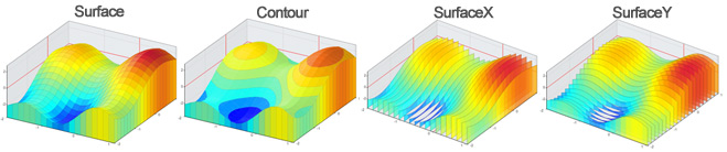
Four base surface types
Surface charts utilize the SeriesTypeSurface enum members to define the series type when used with the Series.Type property. The following four surface types are available.
|
|
|
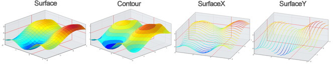
Surface: The surface type draws a 3D surface or a 2D heatmap. It supports the Series.InterpolationFillFactor property which accepts an integer specifying the number of different x and y color sections to split a single tile into. Surface supports 2D and 3D as well as 2D in 3D mode.
Contour: The contour type draws a 2D or 3D surface partitioning the plane into a number of contours defined by Series.ContourCount. Contour supports 2D, 3D, and 2D in 3D mode.
SurfaceX & SurfaceY: These types are similar to surface except they connect points over only the x or y axis and no surface is filled unless the DrawToFloor option is used. When used with the DrawToFloor option, they resemble AreaLines.
|
Series layering Only data from the first series is plotted on a surface chart, however, multiple series can be added with different settings to create more complex visuals. The additional series will render using the first series' data but with their own styling and type settings. This code can be used to add a 2D contour visualization to a 3D surface chart. |
|
Series Type Variations/Options
The following properties are available per surface series types:
|
ContourCount |
InterpolationFillFactor |
DrawToFloor |
Use3D |
|
| Surface |
|
|
|
|
| Contour |
|
|
|
|
| SurfaceX |
|
|
|
|
| SurfaceY |
|
|
|
|


| Series.ContourCount | The contourCount setting specifies the number of contours to divide the surface into when used with SeriesTypeSurface.Contour. The z value range is divided into this number of contours evenly. |
| Series.InterpolationFillFactor | This property is used with SeriesTypeSurface.Surface. When the setting is higher than 1, the tiles connecting the surface points are split and draws multiple interpolated colors. A setting of 2 divides the tile into 4 different color sections for example (2x2). |
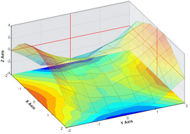
| DefaultElement.DrawToFloow | When this setting is set to true, 3D surface and contour series fill the outside bounds of the surface connecting them to the chart area floor. It can help enhance visualizing the outside edges of a surface shape. This setting is not applicable with 2D series. When used with SurfaceX or SurfaceY, the visual resembles AreaLines. See image below. |
| Series.Use3D | This setting indicates whether a series is drawn in 2D or 3D. |
Types with DrawToFloor Enabled
Coloring Surface Series
|
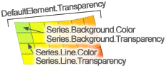
By default, a surface or contour series will use a single color defined by the chart palette or default element of the series. It is much more useful to color surface charts with dynamic colors based on the z value. The smartPalettes enables this functionality. See the SmartPalette tutorial for more info and options. Legends Surfaces are drawn by connecting elements, then filling sections and drawing the outlines. When dynamic colors are used, static colors can overwrite the styling of lines and fills independently. The fill and line transparencies can be set independently as well. Lines can also use other styling specified with Series.Line properties such as DashStyle. Series.Background is used to control the fill through color and transparency settings.
|
|
Following are some examples of color and transparency tasks and code necessary to achieve them.
|
Creating a smart palette from data and a list of colors: Apply uniform transparency for the surface: |
Control transparency of just the fill: Control transparency of just the lines: |
Use a solid color for the fill:
Palette Transparency Features
The SmartPalette also supports transparent colors enabling sections of a surface to be translucent or transparent. A number of samples are available to demonstrate these features.
This sample demonstrates using a palette that includes a transparent color. Color transparency is interpolated between it and solid colors within the palette resulting in a smooth visual.
When the smart palette does not encompass a value, those sections will not be rendered.
This functionality can be used to render a heatmap on top of an image.
Axes and surfaces
The axes of a 3D chart support most of the same features as combo charts. Different scales like logarithmic, inverted, scale breaks, etc. are all supported on surface charts. Surface charts support only numeric axis scales at this time however, time and category scales can be easily emulated as described below and in the Data Population section above. 2D surface charts support only numeric scale also, but they support all other numeric axis features like axisMarkers and range ticks because the core combo chart rendering is used for the chart area and axes. Some features like axis markers are not supported in the 3D view but custom ticks can be used to simulate single value axis markers by changing the tick's gridline properties.
Time / Category Axis Scales
Surface charts support only numeric axis scales at this time, however, other axis features allow replacing the axis labels with strings which enables simulating any type of axis necessary. In order to use string axis labels relating to surface data, create an array holding the text labels and use the array index value instead of the string to specify the x values for the data. Then iterate the string array adding axis ticks with the array index as the value and corresponding string as the tick label text. This will replace the numeric ticks on the axis with the correct labels.
The method Series.GetSurfaceData() outputs a list of DateTime objects that can be mapped to the axis ticks and is demonstrated in the following samples:
SurfaceTimeDB - Demonstrates populating a surface chart with live date based data.
SurfaceDateGrouping - Demonstrates populating a surface chart with live date based data offering an option to select the date grouping interval.
For more information, see the Data Population section above.
Axis Scales
By default, axes with a Scale.Normal setting behave slightly different than they do with combo charts. With surface charts, the axis range snaps to data to remove any gaps whereas with combo charts the axis range maximum values are rounded up to the nearest interval.
The supported scales are:
- Normal
- Range
- Logarithmic
Z Axis
The z axis of a surface chart behaves the same as the x and y axes. It can be accessed through the Series.ZAxis and Chart.ZAxis properties.
ScaleBreaks
ScaleBreaks are supported, they are drawn as a line with a zigzag in the middle. This line styling can be controlled through Axis.ScaleBreakLine.