A gauge chart (dial chart) represents one or more values as needles on a circular or semicircular surface. .netCHARTING supports multiple gauges or dials on a one chart in addition to a single gauge or dial per chart. It also supports multiple needles (elements or points) on a single chart along with an extensive array of customization options. This chart type is particularly suited for executive dashboard implementations.
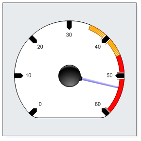
This gauge chart demonstrates a single value represented by a blue needle. The axis tick marks have been customized with an arrow point and display with a thick bold appearance.
Axis markers have been defined with custom background color and hatch styles to highlight two areas of the gauge. Gauge clipping is enabled which means that areas of the dial surface without numbers are cut. This results in the flat bottomed circle seen in this chart.
The gauge sits on a grey chart area with a slight drop shadow effect.
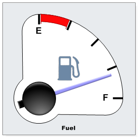
This gauge chart demonstrates a single value represented by a single needle. The axis tick marks have been customized with thinner appearance without any arrow point.
An axis marker has been defined with a red background color to highlight the first quarter of the gauge.
Gauge clipping is enabled resulting in an attractive looking quarter gauge chart.
An axis level image (gas pump) icon has been added which displays in the center of the gauge.
Finally, an alternative shading effect mode displays the gauge needle with and ending block.
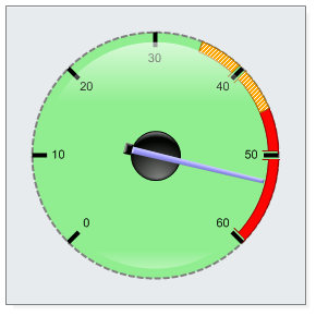
This gauge chart demonstrates a single value represented by a blue needle. Axis markers have been defined with custom background color and hatch styles to highlight two areas of the gauge. A 3D glass highlight effect has been added to the surface of the gauge. The axis has been customized with a dashed grey line.
A shading effect has been enabled which shows the needle on top of the center with an end cap.
The gauge sits on a grey chart area with a slight drop shadow effect.
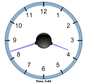
This gauge chart demonstrates two values represented by blue needles. Needle length has been specified on a per element basis.
The axis labels have been customized with a larger font. A blue axis marker has been created for the entire range to make the chart appear as a clock.
The gauge has been rendered as floating with no title, legend or chart area background.
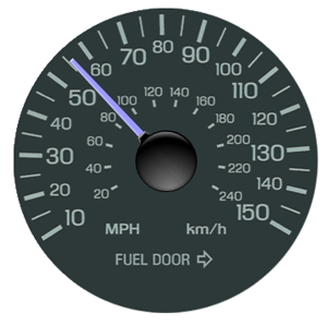
The axis, tick marks and tick labels have been completely removed. A custom series level background image (photo of a real gauge) has been set and the needle dynamically rendered on top.
A transparent image background was used so that if a chart area background was used the gauge would render with it seamlessly.
For this example, the gauge has been rendered as a floating chart with no title, legend or chart area background.
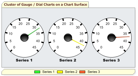
Multiple gauges may also be rendered on a single chart surface. In this case 3 series are created, and each gets their own gauge face. It would be simple to show the same three values on a single gauge by using one series with 3 elements instead.
In this example both the title and legend boxes are rendered.
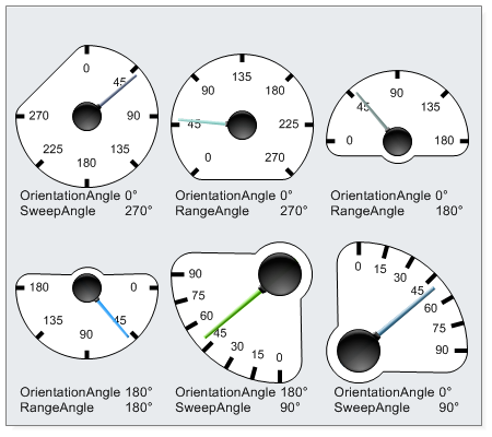
Extensive control is provided for the gauge angle in the starting point of the gauge, its orientation and amount of coverage in degrees.
The orientation angle controls which angle the gauge is orientated towards. When using sweep angle it determines where the sweep will start. When using range angle it will center over the orientation angle.
These charts show various options for orientation angle, range angle and sweep angle.
View more ASP.NET Chart Types, View Pie and Donut Charts, View Map Charts