The purpose of the following walkthrough is to demonstrate how quick and easy it is to chart your own data using .netCHARTING. We will take a database of newsletter subscribers and display the rate of subscriptions over time.
Step 1:
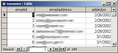
Start with a simple database and blank ASP.NET page.
Database structure.
Our blank ASP.NET page
<script runat="server">
void Page_Load(Object sender,EventArgs e)
{
}
</script>
<HTML><HEAD><TITLE>Orders Report</TITLE></HEAD>
<BODY>
</BODY>
</HTML>
Step 2
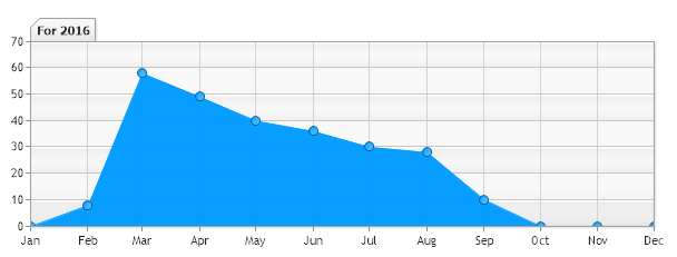
This is the core of our demo, we will add the code needed to show subscription rates over the year.
// Register the control
<%@ Register TagPrefix="dotnet" Namespace="dotnetCHARTING" Assembly="dotnetCHARTING"%>
<script runat="server">
void Page_Load(Object sender,EventArgs e)
{
// Database Connection String
chart.DefaultSeries.ConnectionString = "mydb.mdb";
// We want to group dates by year/month
chart.DateGrouping =
TimeInterval.Month;
// A simple query: first column returned are the
x axis
values and the second column
// are the y axis values. In this case the first column returns dates.
chart.Series.SqlStatement= @"addedon, SELECT 1 AS q FROM myusers";
// Show the data as an area line.
chart.Series.Type =
SeriesType.AreaLine;
chart.SeriesCollection.Add();
}
</script>
<HTML><HEAD><TITLE>Orders Report</TITLE></HEAD>
<BODY>
<dotnet:Chart
id="chart" runat="server"/>
</BODY>
</HTML>
And just like that, with seven lines of code, we get a chart showing the rate of newsletter subscriptions from our own custom database.
Step 3:
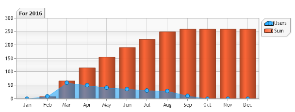
In step 2 you saw the rate of monthly subscriptions however it was not clear what the total subscriptions were on any given date. This is also simple to implement with .netCHARTING using a new dynamic series based on the information already in the chart.
// Register the control
<%@ Register TagPrefix="dotnet" Namespace="dotnetCHARTING" Assembly="dotnetCHARTING"%>
<script runat="server">
void Page_Load(Object sender,EventArgs e)
{
// Database Connection String
chart.DefaultSeries.ConnectionString = "mydb.mdb";
// We want to group dates by year/month
chart.DateGrouping = TimeInterval.Month;
// A simple query: first column returned are the
x axis
values and the second column
// are the y axis values. In this case the first column returns dates.
chart.Series.SqlStatement= @"addedon, SELECT 1 AS q FROM myusers";
// Show the data as an area line.
chart.Series.Type = SeriesType.AreaLine
// Lets set a transparency for the area
line so the running sum behind it is visible.
chart.Series.DefaultElement.Transparency = 50;
chart.SeriesCollection.Add();
// Lets add a calculated running sum
series. Now the chart will have 2 series.
chart.Series.Name =
"Sum";
chart.Series.Type =
SeriesType.Cylinder;
chart.SeriesCollection.Add(Calculation.RunningSum);
}
</script>
<HTML><HEAD><TITLE>Orders Report</TITLE></HEAD>
<BODY>
<dotnet:Chart
id="chart" runat="server"/>
</BODY>
</HTML>
The chart now shows a running sum of subscribers.
Conclusion
As you can see the control makes it very easy to extract data from your own database and display it visually. There are many more powerful features not touched on in this walk through. To explore the full power of .netCHARTING please download our free development version or visit the live demonstration.