
A pie chart represents one or more values as slices of a circular surface in 3D or 2D views. Donut charts are identical to pie charts except for the fact that a hole is cut out of the center of the circular surface, creating a donut shape. .netCHARTING supports multiple pies or donuts on one chart in addition to a single pie or donut per chart. Chart series can each render as a slice for a single pie or multiple series can be drawn with their own pie for each series. Pie and donut charts are excellent for displaying data comparatively, showing the specific values for each slice, or automatically calculated percentages.
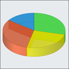
This pie chart demonstrates a single series with multiple elements in 3D view. Variable transparency support enables you to control if the inner structure, or wire frame, is visible. In this example a small amount of transparency is used to enhance the appearance of the pie.
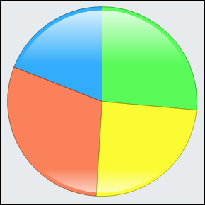
This pie is showing the same chart in 2D view. While 3D charts add visual eye candy, 2D charts are easier to read accurately. For this reason a shading effect is implemented to enhance the visuals of 2D pies while maintaining the ease of information communication afforded with a 2D chart.
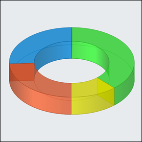
The donut chart is particularly compelling in 3D views. Here it is shown with partial transparency so the wire frame structure is visible. Donut charts can also be exploded (where each section of the donut is separated instead of joined to the adjacent section).
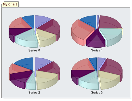
Multiple pie or donut charts can be rendered within a single chart area. In this case 4 pie charts are shown with the exploded view style.
View Organizational Charts, View Gauge and Dial Charts, View Map Charts